CLIENT:
Fiorentino
INDUSTRY:
Floral Design
MEDIUM:
Brand Identity
THE PROJECT:
PROJECT:
Fiorentino redefines floral artistry services at both service and retail levels, extending its narrative across Greece.
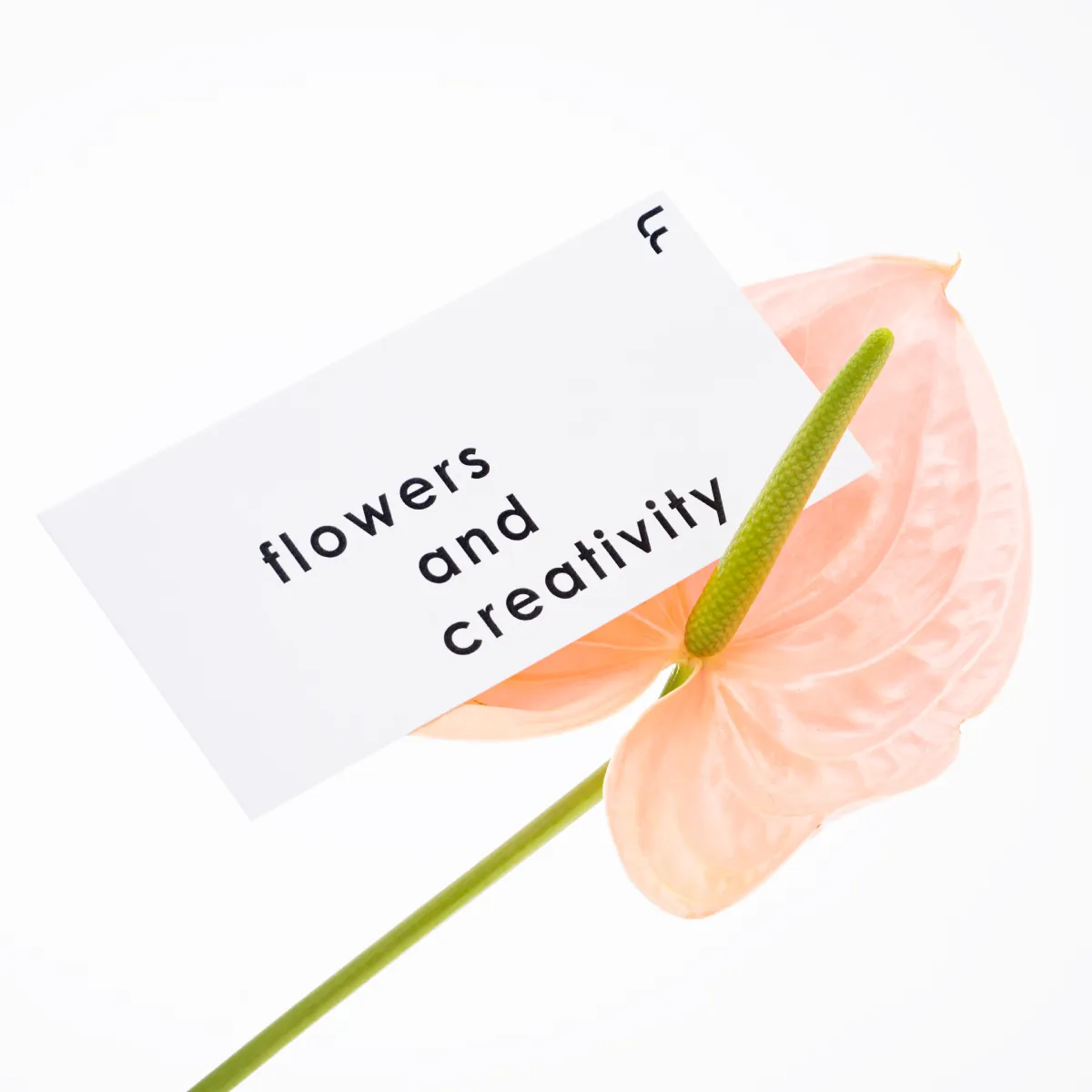
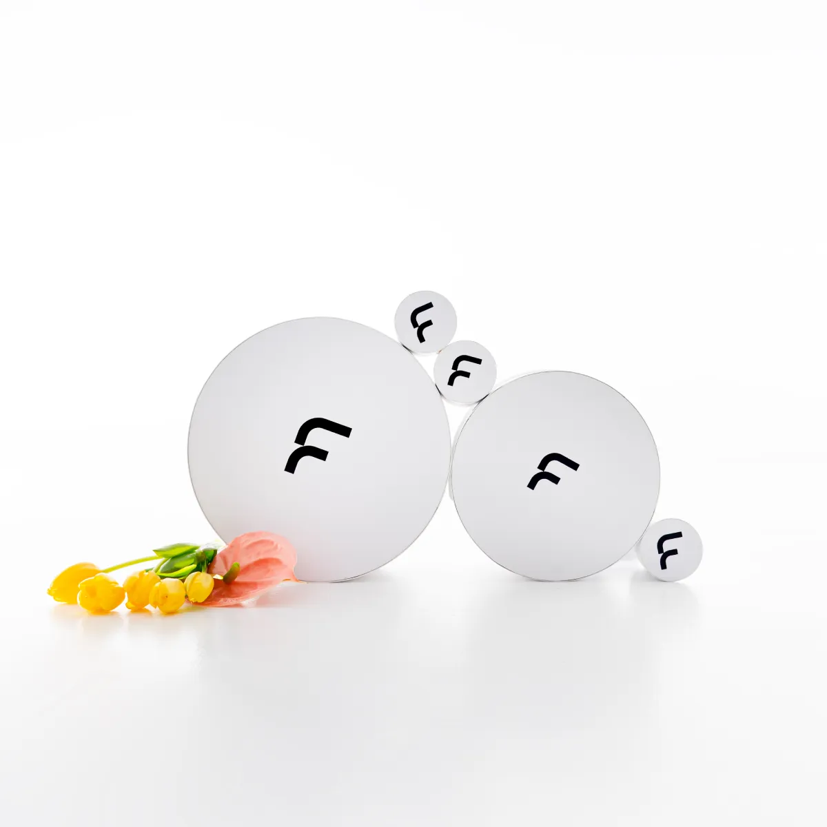
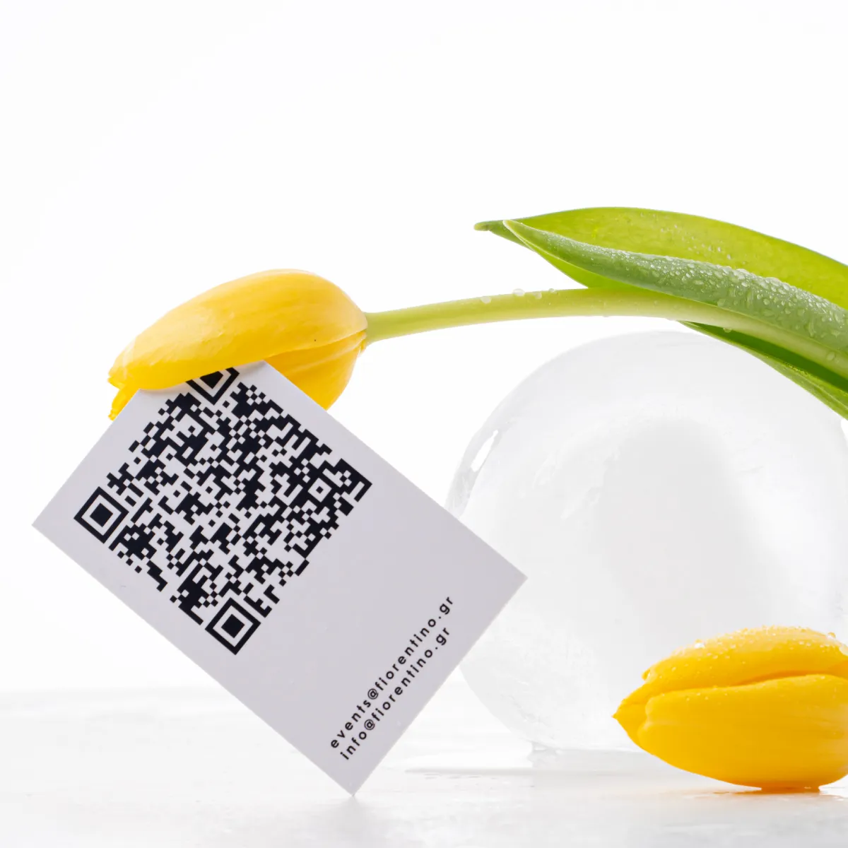
With the need for consistency between its actions and image, we undertook a comprehensive rebranding. Typography serves as a key guiding element, where the relationships between character weights and spacing create an environment that intuitively signals the presence of the brand identity—even in the absence of a logo. Changes in typesetting and the black-and-white palette are the core aesthetic elements, allowing the flowers to remain the focal point for the customer. The brand identity applications incorporate these typographic elements and adapt according to the user’s experience in every interaction with the brand.